1352 South Street
 |
| Ugh. |
Just look at this asswall. The facade can't make up its mind. It can't decide if it wants to be brick, glass, black panels, or exposed concrete. The big-ass openings for the big-ass balconies look dumb.. like they forgot to finish the rest of the brick. The units inside look pretty damn awesome but the exterior suffers as a result. Oh and they named the building after its address, which I hate.
Ah, that housing boom. When there were like 200 building proposals going at the same time and an assload of cranes, big and small, in the air. The 1352 Lofts project was going to bring that shitbird 1300 block of South Street into the next epoch. Remember when this part of South Street when it was all empty lots and you could see deep into Hawthorne?
 |
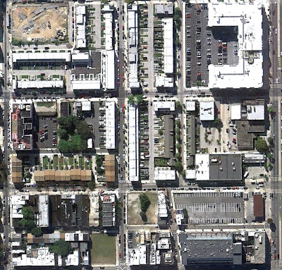
| March 2004 Aerial view. South Street runs along the bottom. |
Enter Rimas Properties. They took this pitiful lot among pitiful lots and planned a mixed-use loftzilla for people who want to plunk down over a million dollars to live on a crappy part of South Street. This is one of those fun proposals where's there's like 800 variations on the rendering. Here's just a few:
 |
| One of the early ones. Its all glass and has a sign like the Arts Bank one on the corner. |
 |
| When construction started in 2005, this was the plan. Getting closer.. still has that sign on the roof. |
 |
| Finally, it's done. Is it just me or do they make less and less sense as they go? |
The developer went fucking bananas over the bad publicity (even threatened to sue message board posters at Phillyblog for talking shit) and tried to work the whole deal out with the dirty-ass city government. Eventually, the developer caved and had the ramp jackhammered back, leaving a concrete strip along the front of the building, making it look even more rigoddamndiculous.
The retail spaces, to this day, are having a hard time getting filled. Though not very tall, the concrete ramp is like a wall that's trying to keep you out of the stores. Bobby Chez was in one for quite awhile but ended up leaving... a shame really, they would have done better in another part of town. Currently, a pediatric dentist is using one of the fronts (wow exciting South Street lol) and the rest are empty as fuck.
This block may be experiencing a little pick-up soon, due to lots of new infill construction and the new boring-ass NIMBY modified apartment building that's about to go up in the crappy garden at Broad and South. No matter how nice this block one day gets, this ugly ass bastard behemoth will still live, fucking up the whole space. Away with you, building!!
 |
| Arial view as of last October. Way less empty. |

It's not that bad, compared to the others that have been featured here, I think. The street presence is good (though that half-raised sidewalk indeed seems perfectly stupid-- ADA requirements?). The opposite side of the building is much worse from a pedestrian's perspective, though I guess you gotta put the garage somewhere.
ReplyDeleteI could see this sticking around and being appreciated 50 years from now.