Showing posts with label Butt-fugly building. Show all posts

Monday, September 17, 2018

Butt-Fugly Building: 11th Street Wendy's

1101 Walnut Street


This little shitbird of a Wendy's holds down a lot that's zoned for a skyscraper. How the hell did this thing get there? Find out at Naked Philly!

Tuesday, July 24, 2018

Butt-Fugly Building: Liberty Shopping Plaza

5th and Spring Garden

Photo by Mr. Fox 
 Did you ever wonder about this weird not-strip-mall taking up perfectly good space on Spring Garden Street? So did I-- read all about it at the Naked Philly Blog!

Monday, May 4, 2015

Butt-Fugly Building: Seaman's Church Institute

475 North 5th Street


             Jesus Christ, what an ugly piece of shit. I understand that its in the Franklin-Callowhill Industrial District so I'm not supposed to expect greatness, but if you're gonna obliterate an entire neighborhood to build industrial garbage with huge surface parking lots in between, at least try to make it look nice!
           Before this building was here, the southern part of the original version of Northern Liberties was an actual neighborhood. York Avenue, the diagonal main street of the district, ran right through the middle of where this building is now.

The area just north of this shitty building, mid 19th Century or so. Library Company of Phila via PhillyHistory.org
           Around 1970, the Franklin-Callowhill Industrial District was created in order to create a manufacturing/warehousing district in the middle of city and supposedly create all kinds of jobs for nearby residents. It was a failure in almost every respect-- urban planning-wise, revitalization-wise, manufacturing-wise... there's not much else to say about it.
          In 1983, the construction of crappy short industrial buildings there wasn't done yet. In that year, Altman Brothers Inc out of Glenside, PA proposed a 23,000 Sq Ft juggernaut of ugly called the East Callowhill Industrial Building (real creative). The unfortunate design was by Theodore Brandow of Brandow Design Associates.
         The facade appears to be that corduroy pants-looking cladding used on all of the worst buildings I've ever seen. The openings in the facade are big and round with some kind of brown stone trim. Its not visible in the pic above but the facade rounds out at the north and south corners. It was 1984, people. Even I have to give them some leeway for that.
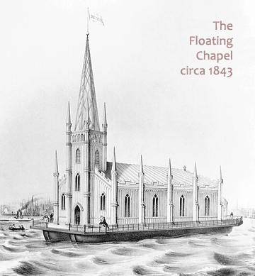
         After the building was finished in 1984, its first tenant was COFCO Group, a.k.a. the Commercial Office Furniture Company. They eventually added to the building and installed a mezzanine/2nd floor office space. In 2002, they sold the place for $2.4 Million to the Seaman's Church Institute of Philadelphia, an ancient organization that deals with support of seafarer's and maritime-related crap. They started in Philly way back in 1843 in a goddamn floating chapel!
          Today, the Seaman's Church Institute shares the building with Color Reflections, a digital imaging company that printed out large images of a fish and some water to cover those big-ass round windows. I guess they didn't want any sun coming in and fucking their shit up.
            As ugly as this pile of shit is, I wish I could say it was the worst-looking building in the shitbag Franklin-Callowhill Industrial District. If you ever have a chance, take a walk around there and check out what a real urban planning mistake looks like up close. You can check out Silk City when you're done, but be careful to put the ugliness of the neighborhood out of your mind before macking on their incredible Silk Cakes.

Monday, March 9, 2015

Butt-Fugly Building: Congregation Mikveh Israel Synagogue V

44 North 4th Street


              ITS A FUCKING BRICK BOX!!!! What a disgrace. Congregation Mikveh Israel, the oldest Jewish congregation in Philly and second oldest in the United States, deserves a much nicer place than this pile of shitbricks. Independence Mall, the collection of grass lots created to honor Independence Hall and the historic district, deserves a much better-looking building fronting it from this side, even though this thing is across the street from the entrance of its underground parking garage. Everything about this just sucks.
           This is Kalal Kadosh Mikveh Israel's 5th building. The first two were at 3rd and Cherry. The third was a nice William Strickland design located at what is now the site of the unfortunate-looking African American Museum in Philadelphia (I can forgive its butt-fugliness considering it was forced to be hastily constructed in 4 months due to Society Hill NIMBYs who fought its original placement at 6th and Pine, but that's a whole other story). The fourth was a badass structure still standing at the southeast corner of Broad and York designed by the NYC firm of Pilcher and Tachau.
         This, the fifth Mikveh Israel Synagogue, was proposed as early as 1953, when North Philly was well into the process of turning to shit. Though once boasting a large Jewish population with numerous venerated congregations, by this point that had all turned to crap. Mikveh Israel was one of the only ones that didn't follow the Philadelphia Jewish families out to burbs. Around the same time, large areas of land near Independence Hall, filled with unbelievably beautiful treasures of architecture from the Gilded Age, were getting the shit demolished out of them to make way for Independence Mall. Areas surrounding it were parsed out into different renewal areas and were later made available through the Redevelopment Authority.
        Mikveh Israel decided that a move to this new renewal area would not only place them back to their original neighborhood, but also cement their presence with all the visitors that would one day arrive there. They hired Louis Magaziner, who designed them a new place before they even knew where exactly it was going to be located. After spending the rest of the 50s fighting over whether to move to Independence Mall or to the burbs, Mikveh Israel finally went ahead and purchased a plot of land on the future Mall, specifically Independence Mall Renewal Area Unit 3 Parcel 14, otherwise known as the former 401 block of Commerce Street.
       By this point, the Vice President of the Congregation was friends with Louis Kahn, so they hired him to design the new place. As much as I might talk shit about ol' Louis sometimes, I do somewhat admire is religious structures. Before I even knew a damn thing about architecture or shit like that, I enjoyed the Unitarian Church he designed in Rochester, New York for the way it uses indirect light to create a certain kind of ambiance inside. Coincidentally enough, Kahn started working on Mikveh Israel right after that church.
       Kahn took this project very seriously and continuously worked on it from 1961 to 1970. His main theme seemed to be centered around playing with light (just like the Rochester place) using cylinders all over the facade. Kahn supposedly went through re-design after re-design and even went through the trouble of making models of not only the whole complex but of individual pieces of it. By the time 1970 rolled around, there was urgency to get this thing done before the Bicentennial and Kahn's $5 million design wasn't going to happen. Mikveh Israel fired him after 9 years and 10 re-designs. Those designs are still heralded as some of his best shit. Some of the models are still on display at MoMA and others travel around the world to be put on display. The ordeal ended up inspiring a whole book that was published in 2009.

A 1964 design from the Athenaeum of Philadelphia.
             The Congregation then hired the successor firm of Paul Phillipe Cret, Harbeson, Hough, Livingston & Larson (now H2L2), for what would by far be their worst design-- which is saying something considering that they're the ones who "modernized" the facade of the Real Estate Trust Company Building.
             From 1972-1975, Mikveh Israel tried to raise enough money to get the new place built, but still came up short with the Bicentennial approaching pretty fucking soon. Then came a great idea: incorporate a museum of American Jewish History to join the brazillion other museums that were proposed for the Bicentennial-era Mall and get that to be the headliner for the new building. It worked. Not only was the congregation able to get a grant from the Bicentennial Committee, a whole new shitload of donors would arrive to help the place get built in time. With the rest of the money borrowed, the congregation went ahead with construction at the end of 1975 on a design even more simplified than originally planned.
            Construction was forced to be pretty fast but didn't even make it on time. On July 4th, 1976, the partially-constructed congregation opened, but didn't have the official opening ceremony until that September.
          So what did we get? A motherfucking brick box facing Independence Mall.

Yay?
          ... and another shit brick facade facing 4th Street.

This one at least has a little bit of design happening, though trees cover it up most of the year.
          Ever since the museum moved over to its own new building in 2010 (another only slightly-more-interesting box btw), anyone who isn't a member of the congregation even knows this shit is there. Very few tourists ever even venture down former Commerce Street unless they are on some kind of guided tour or are wondering what those Georgia Guidestones-looking things in front of the entrance are. That's crap.

        Speaking of which-- what the fuck is that shit? Let me take an aside here to talk about this shitty piece of public art.

Butt-Fugly Public Art: Netanyahu Memorial by Buky Schwartz


                This pile of rocks right here was created in 1986 to honor Lieutenant Colonel Jonathan "Yoni" Netanyahu, a legendary Israeli Army soldier who attended Cheltenham High School and was killed in action at age 30 during Operation Entebbe on the same day as the Bicentennial. You may recognize his last name from his little brother Benjamin, the current Prime Minister of Israel.
              From what I understand, this guy was pretty badass, and therefore it is understood why there should be a memorial to him at Mikveh Israel. Somehow, this has been interpreted as a rectangular piece of granite that had the middle chipped out of it and then placed back into a rectangle. The artist was Buky Schwartz, a guy who specialized in many sculptures with box, square, box, rectangular, and box-related squarish-rectangular qualities.
            What happened to statues? Memorialize the fucking guy with a statue! Remember the old days, when bad-ass military heroes got kick-ass statues of themselves on big-ass horses and shit!?!? How the hell did cool stuff like that get reduced down to a bunch of fucking granite slabs?! You don't even have to go that far back into history to find a cool military statue...here's one from Nicaragua memorializing an unknown soldier:

Now that's how you fucking do it

Monday, February 9, 2015

Butt-Fugly Building: Spring Garden Towers

1820 Spring Garden Street

blechh
                 Jesus, what trash. I know its an old folk's castle but still... what the hell did these seniors do to deserve a fate like this? Did you even take a dump that was all painful and difficult and then you look back at the bowl and your dookie is a weird color? That's the color of this building.
                The origin of this thing goes all the way back to 1976, when lots of buildings were being proposed in this area as a part of the failed Franklintown revitalization project. An old folk's apartment building was planned on what was then a thin parking lot at 1818-1820 Spring Garden Street. Back then, this was no where you wanted to be. Old abandoned industrial shit filled many blocks to the south and east while a dying neighborhood stretched out to the north.
              The architect was the crappy firm of Nowicki & Polillo, whose other works include such butt-fuglies as Academy House, 1845 Walnut, the Gateway Building, and the Archdiocese Office Building. Have you ever met anyone who thought those buildings looked good? No? OF COURSE NOT!!! Then, once it opened in 1978, they called it "Spring Garden Towers". TowerS!?! ARRGGHHH!! Why the fuck do they ever name single buildings with a plural!?!?! Museum Towers next door does the same fucking thing, but at least the second one is just about to be built.
            Another thing that pisses me off about this building is that it does the same shit like 1635 Market where the front of the building is just a blank wall with a column of windows in the middle. Its easier to see from the back:

Yuck!!
              What an embarrassment. Get this: not only is it filled with NIMBYS, its NIMBY-hood was guaranteed as part of its construction! When all the Franklintown shit was happening back in the 1970s, the Lutheran Associates who developed this place were able to secure the air rights of 1822 Spring Garden, the little building next door. Of course, no one told Jon Federman of Nette Properties this in 2004 when he bought the place for $1.8 Mil with the intention of putting up a 40-story condo there.

Its looks like a Sega CD game. Full motion video!!!
                 Though this building was probably pipe dream to begin with, the Spring Garden CDC NIMBYS went fucking bananas and the residents of Spring Garden Towers lost their shit as well. By the end of 2006, approvals supposedly went through for this monster but lawyers and shit got involved after that... then the economy tanked so it never happened.
                 Nowadays, the new Museum Towers II complex is about to be built to the south of this thing and it seems like Forest City, the developer, doesn't want to even try to fuck with Spring Garden Towers so the section of the property directly south of this crap tower has short townhouses that are hiding a short parking garage. Whatever... at least the parking lot will be gone.

The future of this hood... Franklintown is finally filling in.
                  

Monday, January 26, 2015

Butt-Fugly Building: Liberty View Apartments

2009-2051 South Street


            Its hard for me to walk down the 2000 block of South Street without puking and this is why. This shitty apartment building is a nearly block-long pile of putrescence that should have never been allowed to happen. See the length of this thing? That's how long it takes me to finish saying "FUUUUUUUUUUUUUCK" every time I see it.
          Its long as crap, short as shit, and is covered in garbage stucco. It has the worst street level presence of any apartment building in this whole goddamn city, and that's saying something. What's with the doors without knobs? The caged-over skylights? The ribbon windows along the first floor ceilings? The uneven roof height? The windows sticking out of the damn walls? The cheap slanted metal roof-cornice things? WHAT THE MOTHERFUCK IS UP WITH THIS PIECE OF SHIT!?!?!?


            Well, I'll tell you. This building was not originally constructed as one building. This was a set of rowhouses between 2009 and 2051 South Street combined into 61 apartment units.

The same buildings, 1964. PhillyHistory.org
                In 1977, a General Partnership called Union Investment Company proposed this abomination and, after getting their ass kicked by the ZBA for about 2 years, finally got approved and started what would become one of the ugliest things to ever hit South Street. The architect was Edward Harrison Bernstein, who despite being in his 80's still practices out of the former fitting-up shop and cleaning shed of his family's old iron works. You know the building-- its the ivy-covered shit at the southeast corner of 23rd and Cherry Streets.
              I don't know exactly when it opened but it was completed by 1980. Ok, so I was just a fetus when this place was created, but how bad was this block of South Street back then that the building had to completely turn its back to the street? Places built in the same time period in the city's shittiest neighborhoods aren't even like this!
             Some new owners in the mid 80s proposed a one story addition on that back that would include a pool and health spa. The ZBA, probably embarrassed that they ever let this thing get built in the first place, denied and denied the idea over and over again until they gave up.
             Nowadays, this place is called "Liberty View Apartments" and is managed by PMC Property Group. Liberty View? You can't see the Statue of Liberty from this building! Do they mean the skyline views that that 3rd floor units have looking north? That's still not a "Liberty" view. For the longest time, I figured that this building was just showing its bad side to South Street and had its nice side on Rodman Street. Boy, was I wrong. On thin-ass Rodman Street, there's just a huge stuccoed wall running all along one side!


                  On the other side of the wall, some of the units have a small patio that faces out to some kind of cement-covered common area with bike racks and shit. What the fuck kind of "Liberty View" is that?

View from Liberty View Apartments outdoor space.
                According to info I've found online, the apartments inside range from $1390-$1740 per month, which is pretty cheap for the area. Some have fireplaces and balconies.
              Look, I understand that this end of South Street wasn't exactly a nice place until fairly recently, but there's no reason to ever build a nearly block-long building with no street engagement save a shitty glass entrance at 2031 South. Though it would be nice if this place was either destroyed or head-to-toe reconstructed, I'm pretty sure that's not gonna happen in my lifetime. So enjoy your shitty late 70s design, everybody. Its gonna be here for awhile.

They made up for the door by having five bays of brick wall next to it.

Monday, December 8, 2014

Butt-Fugly Building: Wholesale Diamond Exchange

800 Chestnut St


             Dammit, 8th and Chestnut, why do you suck so much!?!? This was once the goddamn nexus of the city, where commerce, the press, and our finest hotels all met at one kick-ass corner. Nowadays, not only does it look like crap, it has looked like crap for half a goddamn century! The Northwest corner has had a surface parking lot on it for over 60 years. The Northeast corner has had a shitty parking garage on it for over 50 years. The Southeast corner has a bad alteration of a 1850's commercial building. Then there's this, the Southwest corner, worst of them all!
        Back when this corner kicked ass, this location was home to the Times Building. What building? THIS BUILDING:

Oh my gooooooooooood Image from the PAB.
                This building actually managed to survive all the way into the 1960s despite a series of fires and having its top floors chopped off. Even in its final form, it looked better than anything else at the corner.

See? Not as good but still not that bad. Image from the PAB.
              In the late 1960s and early 1970s, the Public Federal Savings & Loan Association went on a crazy building spree, throwing up new branch offices all over the region. Included with this would be a brand new main branch. The location? This corner, 8th and Chestnut... probably chosen because of its proximity to their old office at 705 Chestnut. Luckily, the Annex of the old Times Building still stands.
             The architect for this and the majority of the other branch buildings put up during this building spree was Steven J. Matthews. This one was proposed in 1969 and was banking away by the time the 1970s began. Public Federal Savings & Loan was done with this spot by the early 1980s and a law firm later took over the place.
             In 1986, the Hyde-Pride Investment & Development Company of Los Angeles came along and wanted to open a Wholesale Jewelers Exchange in this location. It would be their third such spot like this and their first on the East Coast. The model was to get small-time jewelers who could never afford a whole storefront in the Jeweler's Row district to be able to rent a small space in the Exchange and therefore be able to represent in the city's main jewelry-buying location-- a Jeweler's Row within Jeweler's Row. The place opened in March of 1986 as the Sansom Wholesale Jewelers Exchange (though not location on Sansom Street) with only 6 out of the 45 booths open, but leases were already signed for many of them. It didn't take too long for the place to fill right up. 
            Jeweler's Row old timers were PISSED about this existence of this place, thinking it would force the prices of jewelry in the other stores to get slashed (jewelry is artificially scarce anyway) and that the place signaled the beginning of the end of Jeweler's Row. Well, its nearly 30 years later and this place and Jeweler's Row are still going strong. The same dudes who were complaining about this place are still in business, by the way. The exchange changed its name to the Wholesale Diamond Exchange and did a renovation of the exterior of the ugly building they're in around 2008.
            I advocate the destruction of this building in the name of re-engaging the corner of 8th and Chestnut. This corner is 2 goddamn blocks away from Independence Hall and one block away from the huge transit nexus at 8th and Market. Its has such massive potential but is held back by the mistakes of the mid-20th Century. If this and the huge parking garage catercorner to it were taken out, that would give 3 out of the 4 corners here prime for awesome development. This is a fantasy of course, its not like the owners of these buildings, who are no doubt making mucho $$$ off of them, will sell just because I said so.. but one can dream.
           However, consider this: there will eventually come a time when there will be preservationists who want to save shitty 1970s urban architecture. Its already begun regarding obsolete urban buildings from the 1940s and 50s, which no one ever cared about until they were endangered. Even an ugly, obsolete 1951-built Public Federal Savings and Loan building in Wynnewood has people going nuts over its possible destruction.
          Therefore, if this building doesn't get replaced now, people will be diving in front of the wrecking ball when the time actually comes. This corner needs HELP and NOW is the time to make it happen.

Monday, November 24, 2014

Butt-Fugly Building: 2nd and Bainbridge

624-26 South 2nd Street


              Jesus, look at this place. Ah, beautiful Queen Village-- a neighborhood that's been through thick and thin over the years but has managed to become a much sought-after enclave. However it still needs to get over a few little things to live up to its full potential. One of those little things is to take care of what is arguably its ugliest and most shitty-looking building, 624-26 Bainbridge Street, which is now in its 40th year of marring the corner of 2nd and Bainbridge.
            Though this place has been associated with Ulana Mazurkevich, Realtor/Celebrated Activist of the Ukrainian-American Community for the last 30+ years, she's not the one who got it built. It was Christaldi Builders who commissioned John Burris in 1973 to design a two story restaurant-club structure to be built on a lot they owned at 2nd and Bainbridge. After getting a Zoning Variance in December of that year, the building was finished in 1974.
           I'm not sure what was going on there the next 3 years but from what I can tell, Stephen Starr took ownership of the place in 1977 or so and opened his second-ever enterprise, Stars (which some people call Starz or Starr's). Into the early 80s, this became a hot venue where some legendary folks performed. Bob Saget credits Stars with starting his stand up career, which to me is enough to re-name this place the Bob Saget Center.
           In 1982, Zenon and Ulana Mazurkevich, who was already running the place next door since 1970, took ownership of the building. In 1990, the building was combined with Ulana's at 205 Bainbridge to become one massive place called Ulana's Restaurant & Club.
           In 1991 it became a nightclub/venue called U2 Club, run by club promoter Bill Poole.  In 1992, it became Club Safari. It was also at one point called Club 2B (Get it? 2nd and Bainbridge) and by 1996 was known as Ulana's Downtown Rock Lounge. In 1997, a third story apartment above the building was proposed and designed by Zenon himself, but it never happened.

Drawing of the building in an alternate universe.
                In more recent years, the club hosted goth and industrial stuff on certain nights, making it pretty much the only place in the area to go for that shit. Other than that, the place appears closed now. Of course, with places like this, its hard to tell. So, not only is this a nasty pile of shit; it may be a Fill This Front as well!
              Anyway, this building is ugly as fuck and makes Queen Village look like Schlocktown USA. Its about time this thing was put out of its misery-- its been 40 fucking years, for fuck's sake. Demolition wouldn't even be required... just a really creative re-facade or something. Queen Village deserves not to have a such a shitbird-looking building as this. Who's up to the physical challenge of making it better?

Monday, November 10, 2014

Butt-Fugly Building: Free Library of Philadelphia Charles Santore Branch

932 South 7th Street


             Fuck this bomb-shelter looking piece of shit right here. I don't care how much people might like it. This 51-year-old asspile is just yet another mid-century building in the city that proves, like many others, that these type of designs don't stand the test of time-- not in Philadelphia, anyway.
            There isn't much to say on the history of this place. It is the sequel to a much nicer 1911-built building that still stands at 5th and Ellsworth. This uglier one was proposed and designed in 1960 under designs from a crap firm called Eshbach, Pullinger, Stevens, Bruder. This firm did a lot of fucking damage to this city. Their other masterpieces include the 9th District Police Station/Rodin Place shopping center/parking garage at 20th and Hamiltion, the Orlowitz Residence Hall at 10th and Locust, and all of the UGLIEST 1960s/70s buildings on the Penn campus, which is saying something.

 Pic by Austin Murphy, Creative Commons License etc etc
            Talk about a building that doesn't fit with its surroundings. Great old brick rowhouses, churches, and schools as you walk around this hood, then you happen upon this goddamn concrete bunker and just yell "WHAT THE MOTHERFUCK!?!?!?" to the sky. It fits less into the neighborhood than the bright red awning of the pizza place across the street. What the fuck were they thinking with this design? It seems to be this common institutional theme from the mid 20th Century where they would make this pentagon shape like when a 5-year-old draws and house and run it over and over again down the street.

The logo of the Capital Area Head Start program looks mysteriously like the Charles Santore Branch

                You can also find this architectural theme in the design of some of the Rec Centers around the parts of the city the vast majority of you will never go. What a bunch of garbage. This 7,700 square foot Free Library branch broke ground on July 11th, 1962 and opened on November 1, 1963 as the Southwark Branch, again the sequel to a much awesomer building of the same name. Oh, did I mention what they demolished to build this piece of shit here?

Early 1962 pic of the awesome fire/police station destroyed to make way for this mess. 
The short time between the demolition of the old and the building of the new. If only they knew.
             The library went through a major renovation in 1998 when all 52 library branches were cleaned up and given internet access. On March 26, 2004, they insulted the shit out of the memory of Charles Santore, former boxer, Republican Ward Leader, and union local founder by naming the ugliest building in his whole neighborhood after him. There was another small renovation in 2010.
              I'm sure the community likes this place and that the library itself is just fine, but what a piece of fuck architecturally. Why the white walls at the corner? All the oddly-shaped rooms on the inside? I feel bad for the residents of Beulah Street who have the back of this shitty building across the street from their front doors.

The original blueprint via the Free Library of Philadelphia. In the 60s they thought having a bunch of slanted walls everywhere was the way to go.
                Look, the predecessor of this library was 52 year old when this place was built. This one is 51 years old now. That means, if we're going to follow to same pattern, a replacement of this building is due. Not that the city will be building new library buildings any time soon. Do this motherfucker a favor and put it out of its goddamn misery. Harrumph.

Monday, October 20, 2014

Butt-Fugly Buildings: Scottish Rite House, Scottish Rite Tower

1525 Fitzwater Street, 1530 Fitzwater Street

Scottish Rite House

Scottish Rite Tower

          
           Whoa whoa whoa hold the phone here... these buildings are from the 1980s and 1990s? What the fuck? I always though they must have been from the 40s or 50s, 60s at latest. Here I was last time talking shit about an old folks home from the 60s, when these two ugly bastards here were built in my goddamn lifetime! What the hell went wrong?
           These two very similar buildings, built a decade apart, were the result of the extreme philanthropy of the United Supreme Council of the Ancient and Accepted Scottish Rite of Freemasonry, Prince Hall Affiliation. In case you didn't know, Prince Hall Masons are the traditionally African-American order of Masons. This particular set had a Horace Castor-designed Cathedral at 1514-20 Fitzwater since 1927, but started taking over almost the entire 1500 block of Fitzwater in the early and mid-1970s. 
           In 1979, they purchased 1511-1533 Fitzwater Street, which was just a load of abandoned rowhouses, and demolished the shit out of them in favor of a big surface parking lot. It was on this lot that they would years later fundraise/get government $$$ and build a 13-story 165-foot Section 8 building for seniors and the handicapped. The name? Scottish Rite House, completed 1986.
           Again, calling a building a house-- I hate that crap. I've said it before: its like calling a truck a car! The design was by a firm that called itself Livingston/Rosenwinkel, who would go on to design the Philadelphia Clef Club building nearby and was one of the firms involved with the design of the Great Wall of Pennsylvania aka the PA Convention Center. Not a great record.
           Over the next few years after this was completed, the Scottish Riteys acquired property after property to the west of their lodge until they owned 1522-1530 Fitzwater, the rest of the block. In 1995, they demolished all the buildings that were there, which included the old Octavius V. Catto Elks Lodge #20, a converted industrial building that had been an historic African-American Elks Lodge since 1928. It was quite the place-- not only was it an Elk's Lodge-- it was a well-known banquet space and spent some time as the Two-Bit Club, a famous dance/bar/debauchery spot.
            Shortly after that, the second building in the complex was completed, the Scottish Rite Tower. The two buildings are the exact same height, yet one is called a House and the other a Tower. Plerff.

Scottish Rite Tower under confucktion.
                 Anyway, these buildings suck butt and I'll tell ya why. First of all, like stated above, you can't even tell what fucking time period they're from. It you put this building up next to Penn Center House or the 2101 Cooperative, they look like they are from the same era despite being several decades apart. Second, I'd hate to be one of these people but it looks like I've become one: they are way way way too tall for their neighborhood. The nearest building exceeding their height is at 19th and Lombard.
                Third, the never-ending puke-colored bricks. I guess they were trying to match the old Scottish Rite Cathedral on the same block, but this type of theme isn't always a great idea-- just ask Jefferson Hospital. They liked the color scheme from the old Jefferson Medical College/Curtis Clinic so much that they used similar-colored bricks for their 1960s and 70s expansions. Sounds like a great idea, but in the end it leads to block after block of butt-fugly.

Nice big blank wall facing the street corner ya have there.
                Fourth, the surface parking. Remember when I told you that the Scottish Rite dudes acquired 1511-33 Fitzwater in 1979 to make a surface lot? Well, a large portion of that surface lot still exists at the corners of 16th/Fitzwater AND Senate/Mole Streets. I won't even count the Lodge's surface parking lot at 1508-12 Fitzwater.
               
There's another totally unrelated surface lot on the next corner.

              What is it with these government-subsidized old folks' homes? Why do they always have to look like shit? I know they're 20th Century government buildings and all, but don't we owe seniors something a little bit better? At least the latest one built in the city, the John C. Anderson Apartments, has SOME level of design to it.

Monday, October 6, 2014

Butt-Fugly Building: Casa Farnese

1300  Lombard Street

"Khaaaaaaaaaaaaaan!!!"crete.
                 Where were the NIMBYs when this ugly piece of shit was built? Casa Farnese is a mid-60s assdisaster that has been effing up the 1300 block of Lombard for nearly 50 years. Out of place, too tall for the neighborhood, built with tax dollars, and an insult to its own intended residents. Like Guild House, this is yet another old folk's home that looks like shit designed by an ass-kissed architecture firm.
                This building exists because of a great Philadelphian, Andrew Farnese. This dude was a lawyer, a banker, a civic activist, president of the School Board, and pretty much everything else. I think he may have in fact invented sliced bread. Columbus Day is a holiday because of this dude.
               In 1959, Congress made available a HUD grant that helps non-profits build housing for the elderly. Farnese was among the first to apply for this grant. By the next year, a crappy vacant lot at the southwestern corner of 1300 Lombard, at the time one of the city's worst neighborhoods, was purchased and a large new senior housing building to be called Casa Enrico Fermi was proposed. They got a design by one of the hottest architects of the time, the firm of Stonorov & Haws, who were also busy with the design of Hopkinson House at the time.
             Unfortunately for them (and us), the design looks like the architect treated it like an art student treats a project in Art School. It was like he fell asleep while working on it the night before it was due so he put together a quick piece of shit and planned to upsell-it during the critique ("I MEANT to make it look like shit"). The building is a big white tombstone that sticks out like when someone has one big outsized tooth that sticks out from the rest. The place was built like a prison, probably because this was a dangerous neighborhood at the time. The Lombard and Juniper Street sides of the thing is surrounded by a huge impenetrable wall that makes the building seem 100 feet away from the sidewalk that runs right next to it. On the 13th Street side, there's a surface parking lot separated from the street by a prison fence without the barbed wire.

The meaning of "pedestrian friendly" in the 60s.
               The designers included a curvy entrance piece to lighten it all up a bit, but that just made it look more dated over the years. Also, the entrance to the underground parking garage is stuffed back on Juniper Street. Its nice that its hidden, but I feel bad for the Juniper Street residents that live next to and across from that entrance. If you want to see something funny, check out this driveway on garbage day when the truck struggles to get in and out of that ramp without smashing into the surrounding houses.
           At about this same time Casa Fermi was designed, Stonorov had a vision for these then-crappy parts of Center City whereby tall modernist buildings would be interspersed within the fabric of the old neighborhoods with the idea that somehow having big boxy white buildings around would clean up the blighted old places around it.

Stonorov himself presenting this idea. Check out the highway planned for South Street.
              From a development standpoint, the construction took awhile to get going, partially because Zoning's ass fell out from under it when they saw the plans for a 288-unit, 22-story building being proposed in this location. After going back and forth with the ZBA for years, construction finally started at the end of 1964 and went all the way through to 1966. After it was done, they fought with Zoning some more over the surface parking lot behind it.
             Andrew Farnese stayed on the board of the place and kept a law office there until his death in 2003. The place was renamed Casa Farnese in 2004. This ugly building has been housing seniors for almost half a century now. Though I hear that the place itself isn't too bad, the design has been outpaced by the rest of the neighborhood. A giant wall around the whole thing is definitely no longer necessary.
              Of course, I'm not the only one who thinks this. The Casa Farnese Preservation Program is an effort to renovate and modernize the building. The most drastic of the changes will be a new entry vestibule and lobby area built on top of the silly curvy thing that's over the entrance. Construction has already begun on this based on designs by Compass Architectural Designs of Voorhees, NJ.


              That's nice and all, but they have to do something about the street level presence this thing has on Juniper Street. I understand that the long concrete wall is probably just the top of the underground parking garage, so maybe it can't be totally removed-- but it can be improved. This building has some importance for being one of the earliest HUD senior homes, but its ugliness tarnishes all that. Casa Farnese Preservation Program, you have your work cut out for you.

"Wow, Gerdy! They're trying to make this building look less like shit!"

Monday, September 22, 2014

Butt-Fugly Building of the Week: Penn Center House

1900 John F. Kennedy Boulevard

Its just keeps on going!
             I've avoided talking about this piece of shit right here for two reasons: 1) There isn't much to say about it 2) Its so fucking ugly I actually feel bad for it. Worst of all, in its time, it was considered the bee's fucking knees.  Penn Center House, from 1959, was following a big trend in Philadephia, the co-op. The 2101 Cooperative Apartment Building was the first, built in 1953, and the trend continued throughout the 1950s and early 60s. 
           The shitty design is from mid-century blahchitect George S. Idell, whose other fuck-ups include the 2101 Cooperative Apartment Building (whose own website does not show any exterior photos of the building due to its nastiness), the Ambassador Towne House (now called Riverwest Condominiums), the Rittenhouse Claridge, the Rittenhouse Savoy, and a third Rittenhouse Square apartment building that was thankfully never built. Though all those buildings are also cocky doo doo designs, Penn Center House really takes the cake. Here's his original rendering, which is actually a little more interesting than the real thing.
          You'd think his guy would know better. He was pretty old by the time he designed this shit-- he studied under such badasses as Paul Phillipe Cret and worked with Wilson Brothers at one point. This dude knew what good shit was and even helped design some of it in the early 20th Century. When the mid-20th Century rolled around, Idell must have lost most of his eyesight or something. His buildings from that era almost look like he couldn't see the paper so he just kept tracing his t-square until he got a grid of windows and said "Whatever, good enough. Facade details? Get the fuck out of here!" 
             This disaster of a building has the Penn Center-era massing-- that is to say the block-long, too-short, grid of bricks and windows. For some reason, the architecture and planning geniuses of the Penn Center era thought what we now call JFK Boulevard should have a building on every block matching the size and shape of Suburban Station... but without the awesome facade. This ends up creating a long boulevard of rectangular walls that create a really shitty urban environment. This one's a little shorter than the others but from the street it makes no difference. Thankfully, one of these wall-buildings, the old Sheraton Penn Center Hotel, was demolished (to make way for a building that was never built called 1777 JFK), so the trend gets broken up by the setback of the Comcast Center.
            Penn Center House's street level doesn't do shit other than display a mid-centuryesque decorative cinderblock grille pattern. Behind that grille pattern is a big-ass parking lot that's visible if you look in one of the holes. Walking down the south side of the 1900 block of JFK Boulevard is difficult-- the building just keeps going and going and going like some fucked up architectural purgatory. It makes the Kennedy House and Sterling seem like exciting dynamic buildings in comparison. Its hard to photograph this building unless you have a badass camera with a lens wide enough to get it all in. In order to properly capture how shitty this thing looks from the street, here's a fully functional streetview. Look around on this and tell me that Penn Center House does any damn good on this block:


What trash... there's really nothing else to say. This building could probably be saved if it got a huge facade redo and some better street-level shit... but it would have to be one helluva design. Oh well, we're stuck with it. Fuck. 

Monday, September 8, 2014

Butt-Fugly Building: Southeastern Pennsylvania Chapter of the American Red Cross

2213 Chestnut Street


              Oh here we go... another concrete box from the glorious architectural era of the early 1970s, fucking up what should be a much nicer corner in Center City. Look, I understand that the American Red Cross does a lot of great things and they support themselves entirely with donations and volunteer work. Good for them, I applaud it. If only the local chapter's headquarters building was built in a different era. ANY other era, really. What a shame. This organization deserves better.
             They should have left the original building here. What was the original building, you ask? It was a nice little structure called Philadelphia School of Nurses and Central Hospital of Philadelphia, which had a lawn that extended out to the corner of 23rd and Chestnut.

Corner of 23rd and Chestnut looking east, 1911. PhillyHistory.org
                  It was the only place in town that offered the Abrams Electronic Treatment. This treatment was one of many forms of quackery under the category of "Radionics" whereby the patient would have a small amount of blood, a lock of hair, or even a photograph placed into Abrams' Reflexophone. According to the read-out from the device, the patient could be diagnosed with lung cancer, strep throat, tuberculosis, you name it. Dr. Abrams himself was convinced that syphilis passed from generation to generation, and that only his machine could detect it in newborn infants. Once the patient was diagnosed, they'd be hooked up to another machine called the Oscillocast which would deliver a series of electric shocks that supposedly lead to a cure.
          Regardless of all that bullshit (irregardless?), the building they were in looked cool. So cool, in fact, that even after the hospital/nurses' school went kaput, the building was covered in stucco, new facade details were added, and the lawn was enclosed behind a nice wall for its next job as the Spanish Embassy.

Yes, this is the same building. The front of it was lobbed off for the widening of the Chestnut Street Bridge in 1911/12. PhillyHistory.org
                By the 1960s, it had become an apartment building. In 1969, the Southeastern Pennsylvania Chapter of the American Red Cross created a building committee with the aim of building a new headquarters in Philadelphia. In 1970 they has raised enough money to purchase the old Central Hospital property and put the then 80+ year old building out of its misery. They commissioned the firm of Ewing Cole Erdman & Eubank for a design, the same motherfuckers who would design Giants Stadium a year later.
               Being that it was 1970, the most cutting edge bad ass design anyone could think of was a squat concrete monolith with rows of windows and an indentation on one side of the facade. They made sure to make the thing as anti-pedestrian as possible by including a below-grade surface parking lot and a wide driveway on the 23rd Street side. I will give them a small bit of credit for the plaza at the 23rd/Chestnut corner, only because it sets the building back just about as far as the Central Hospital's lawn was.

Pedestrian-friendly street level presence by early 70s standards
                   The new ugly-ass Red Cross building officially opened on November 3rd, 1972. There was a ceremony where the cornerstone was filled with "historical items", whatever that may mean. Maybe they threw one of those Abrams devices in there.

A surviving Oscillocast from The Lindan Collection of Medical Devices.

Monday, August 25, 2014

Butt-Fugly Building: Barclay Bros Building

1510-12 Sansom Street

Blech
                Kind of a short one today because this building right here doesn't have much of a history, save for its ugly-ass design. Nonetheless, it shall be called out.
                 Ya know, I really love the 1500 block of Sansom Street... its one of the only streets left in Center City that harkens back to the city's early-mid 20th Century look, when small formerly residential and commercial buildings would get stuffed to the gills with retail stores and offices, each putting up signs that stuck out into the street. This block is one of the only blocks left that carries that old spirit. However, this building right here fucks up the rhythm of the whole thing. A mid-century shitpile with late 80s alterations. Two horrible time periods in architectural design combine for one ugly-ass building.
                It started in 1960 when the Barclay Brothers printing firm, makers of blueprints and photostats, decided that their little workspace at 1516 Sansom wasn't enough. They purchased 1510-1512 Sansom Street and kicked all the tenants out. That November, they proposed a new 9,300 square foot reinforced concrete facility designed by W.F. Silliman, a silly man who did a lot of architectural design work in Philly but, from what I can tell, only has one other surviving structure in town (and it sucks too).
                The design got rejected by zoning-- not because it was going to be ugly, but because it had no outdoor space. The code of the time required 5% for this particular parcel. After 4 months of going back and forth with the ZBA, the Barclay Brothers firm's ugly new building was approved. Demolition and construction started in March 1961 and was over by the end of the year.
               Unfortunately, I can't seem to find a photo of the 1961 configuration of the building's facade (it must have been so bad that no one wanted to take a picture of it) but the windows were all in the same places so you get the idea. So what happened that makes it different today? Well, Barclay Brothers got bought out in early 1986 and the building sat vacant for three whole years after that.
               In 1989, the dentist that still works on the third floor of the building today took ownership of the place and gave it a head-to-toe renovation. Included in this was a whole new facade designed by a firm called the Kwait Organization, which sounds like it was named after a Klingon. I'm not sure exactly how much they changed but the construction permit issued September 20th, 1989 states in part:

NEW FRONT FACADE, ATTACHED TO EXISTING STRUCTURE INCLUDING NEW OPENINGS FOR WINDOWS, STOREFRONT, AND ENTRANCE...

             Whatever they did, they fucked up. Look at that piece of shit. Dirty-ass cement/fake stone-looking crap for a facade, glass blocks, ribbon windows. Ass! There's nothing much else to say about this place other than IT SUCKS! Fuck it, I'm done.

The crap Barclay Bros Building next to its much better-looking 1890s-built predecessor to the right. Pitifully enough, this was almost the last picture I would ever take. About 15 seconds after I shot this, a car coming out of the parking garage across the street almost ran me over.

Monday, August 11, 2014

Butt-Fugly Building: The Stein Bellet Building

1624 Locust Street


                Holy fuck, what the hell went wrong here? There aren't a lot of Center City buildings from the 1940s... based on this building, we should be happy about that. This boxy piece of trash is made even more awful by the fact that its located on one of the most architecturally important blocks in the whole city.
            The origins of this building go all the way back to December 6th, 1910. In that year, the R.W. Downing Residence at 1624-26 Locust Street burned down, creating an empty lot that would become surface parking for the next 3 decades. In 1946, a fraternal organization called the Towne Club bought the lot and the house next door (1628 Locust), and started construction on what would become their new clubhouse. After putting up three stories of steel frame, the clubhouse plans fell through, creating a huge piece of blight on one of the city's most beautiful blocks.
            In 1947, the Connecticut Mutual Life Insurance Company bought the half-constructed mess and commissioned the same architects, Thalheimer and Weitz, to design a six-story office building suited to the needs of their already-acquired tenant, the Remington Rand Corporation. That's right-- this robot-looking box of ass-trash was designed by the normally-badass firm of Thalheimer and Weitz.
            How could this be? These are the same guys who did the North City Trust Company I wrote about for Hidden City a few weeks ago! These guys were Philly natives from Strawberry Mansion who were both proteges of John Torrey Windrim, one of the most badass architects that ever lived! How did they fuck up so badly on this one? The only excuse I can think of for them executing this atrocity is that their tenant was going to be the Remington Rand Corporation, the guys who created UNIVAC and pretty much changed the world as we know it. They are still around and are based in Blue Bell, PA as UNISYS. Maybe they were trying to make the building look modernish to match the shit Remington Rand was doing at the time.
            The building was completed in 1948 and became known as the "Remington Rand Building", one of many with the same name they worked out of in almost every major city. The other ones in other cities from the same era were also very modernist, but were way better looking than the Philadelphia branch. Remington Rand/Sperry Rand stayed there into the 1960s.

As the Remington Rand Building in 1952
                    By 1970, mega-developer Strouse Greenberg and Company took over the place and made it their headquarters, renaming it the Stouse Greenberg Office Building. They renovated the building and altered the first floor to its current configuration, making separate entrances with separate addresses. Here's a photo of it from 1976. During this period, they rented out offices in the upper floors to all different kinds of occupants, including some architects! They had architects working in THIS building? That's a shame. Strouse Greenberg was a great developer that constructed all kinds of shit all through the region and restored a number of old Philadelphia buildings that were falling apart. They stuck around in this shitty building until 1995.
                  By 1996, the building's current headliner, the American Cancer Society Pennsylvania Division, was in there and doing the good works they do there to this day. The building was named Stein/Bellet Building around this time. The Stein/Bellet Foundation is a philanthropic organization that contributes heavily to the American Cancer Society. The Society was able to buy the building for $1.48 Million in 1998. I'm not sure exactly when, but that big-ass ostentatious sign bearing the building's current name was installed around that time.
                 How the hell did that sign get a permit? Its fucking gigantic and is not very original to the building's configuration. Did I mention that this building is historically registered with the city? Why the fuck does the sign say "THE Stein Bellet Building" on it? The "THE" is necessary?
               Anyway, fuck this building. I'm aware all this good shit has happened inside, but its ugliness tarnishes all that. This block has buildings by John Notman, Horace Trumbauer, and Cope-Stewardson-- architectural badasses that could design a building better-looking than this using pencils held in their dickholes. Even the newest building on the street, Lenfest Hall, designed by the same firm as the fucking Guild House, respected the street's architecture and saved a couple of old facades. Plerff!!!
            
The T's crooked.